
 |
|
|||||||
| SageMC Custom Interface This forum is for discussing the user-created SageMC custom interface for SageTV. |
 |
|
|
Thread Tools | Search this Thread | Display Modes |
|
#1
|
||||
|
||||
|
The SageMC Screenshot Thread
So now that we have the ability to really customize the look and feel of SageMC, here's where we can put all the purty pictures to show off our late hours of tweaking and fiddling with the layout!
Please remember to keep pictures a reasonable size.  btl.
__________________
PHOENIX 3 is here! Server : Linux V9, Clients : Win10 and Nvidia Shield Android Miniclient |
|
#2
|
||||
|
||||
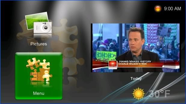 This is one of the concepts I'm playing with. The menu list scrolls up and down, with only two visible at anyone time. Once we are able to wrap vertically on a vertically scrolling table, I suspect this is the layout I will use.
__________________
PHOENIX 3 is here! Server : Linux V9, Clients : Win10 and Nvidia Shield Android Miniclient |
|
#3
|
||||
|
||||
|
This is what I'm using currently.
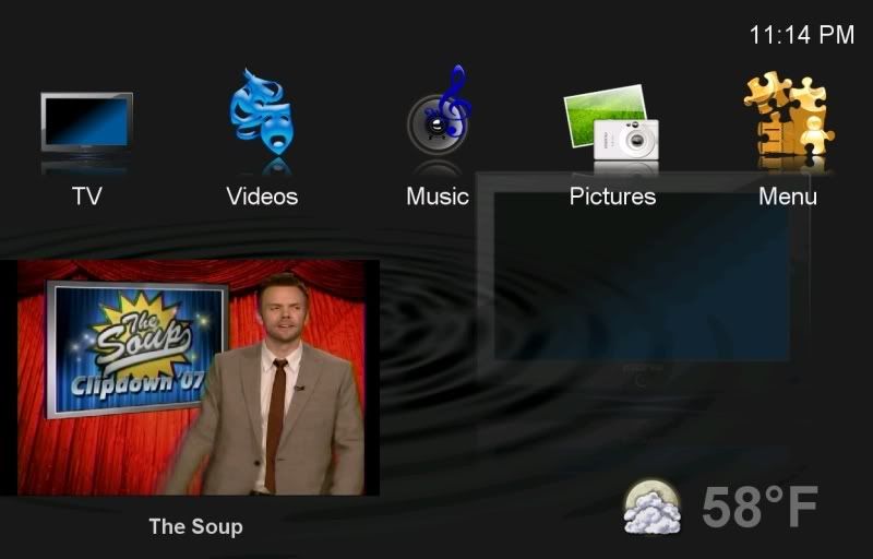 There is no highlight for the active menu item - you have to look at the big icon to see what is selected. I like the simplicity. This layout also wraps nicely on the main menu items when scrolling in the horizontal plane.
__________________
PHOENIX 3 is here! Server : Linux V9, Clients : Win10 and Nvidia Shield Android Miniclient Last edited by bialio; 12-21-2007 at 11:20 PM. |
|
#4
|
|||
|
|||
|
Your theme is looking great! It's nice to finally see something that doesn't look so similar to the old MCE2004/5 UI.
|
|
#5
|
|||
|
|||
|
The Escape
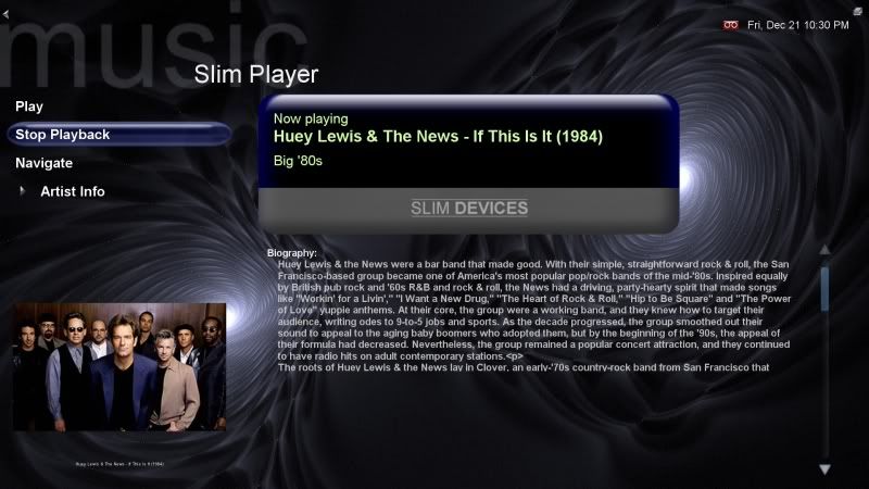
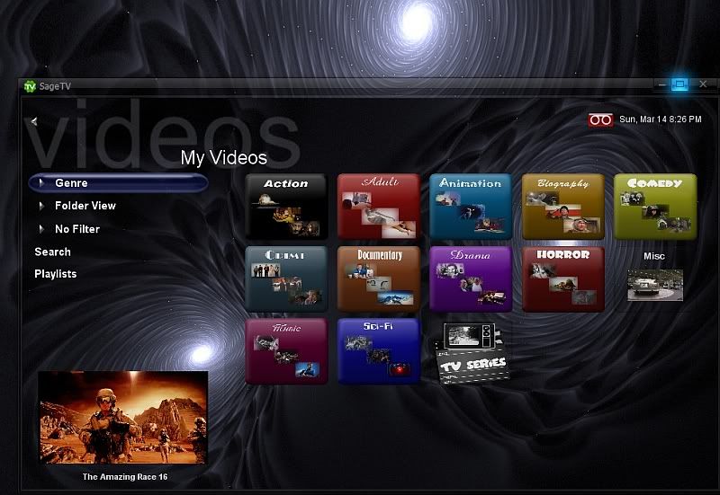
I haven't had this much fun with my HTPC since I gave up on MEEDIO!! Dirk and Mike--Thanks!!
The first image is how I currently use Sage. This is a simple layout, with basic changes in fonts, icons and colors. The second is icon based that I'm playing with, but WAF is lower. PS: Sorry I don't have anywhere to host the pics. |
|
#6
|
||||
|
||||
__________________
Upgraded to Comcast X1 + Netflix/Amazon Video streaming ***RIP SageTV*** Last edited by mkanet; 03-14-2010 at 09:31 PM. |
|
#7
|
||||
|
||||
|
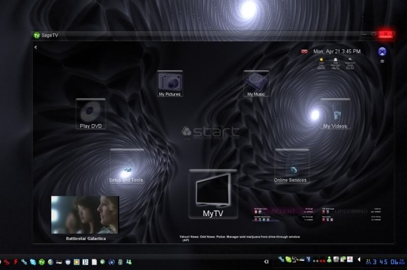
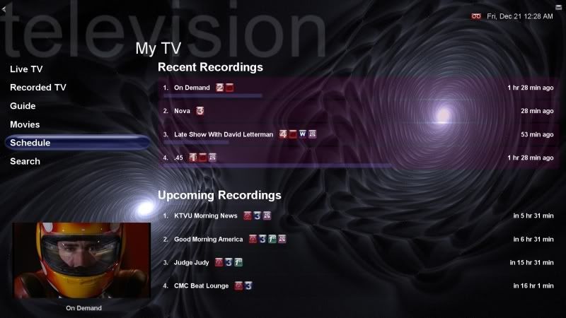
Wow mkanet, gorgeous UI !
hope to see this in the downloads section someday 
|
|
#8
|
|||
|
|||
|
These are some of the one's I've been playing with. I'm currently using the last one, but that may change at any given moment!
    
__________________
-Jason |
|
#9
|
||||
|
||||
|
I'm only just beginning to play - this is my first attempt.
I grew tired of navigating to My TV in order to choose Recordings or Guide. I also didn't like some of the items hidden under My Menu. I electred to incorporate what I typically use on the Main Menu, and then, hidden from view, the bottom row (fourth row) provides access to Settings, My TV (in case I need it), etc.. Ted  Oh, mkanet, how did you get the background to match on the Slim Player page? I didn't think it allowed for that and mine is still the plain black that it came with.
__________________
W7 64-bit, SageTV V7, Phoenix2 Asus P5W DH-Deluxe Motherboard, Core 2 Quad, 12 GB DDR2, 250 GB OS, 2 TB Recordings, 6 TB Movies (holding DVD library), nVidia 285, HD PVR 1212 x2, HDHR x2, Zalmann HD160XT case, Harmony 890pro Remote. Pioneer 50" KURO Plasma, Pioneer Elite 7.1 surround A/V receiver, Energy & Paradigm speakers. Last edited by Ted@TNT; 12-22-2007 at 09:02 AM. |
|
#10
|
|||
|
|||
|
This would be really nice if you showed 3 icons and the list scrolled leaving the current selection in the middle position.
|
|
#11
|
||||
|
||||
|
Thanks, I've gotten PM's asking me for packaging this into a downloadable theme . All the real work is from MeInMaui (Mike). Without him, we wouldnt be having so much fun with SageMC.
__________________
Upgraded to Comcast X1 + Netflix/Amazon Video streaming ***RIP SageTV*** |
|
#12
|
||||
|
||||
|
No major changes, just showing that overlap isn't such a bad thing and allows for bigger sections without losing functionality or visibility...

__________________
Al Bsharah / Twitter Clients: Two STX-HD100 High-Def Extenders Media Server / NAS: Case: Thermaltake Armor CPU: AMD Opteron 1218 (2.6GHz Dual Core) Motherboard: ASUS MN2-LR Memory: 2GB Gfx Card: Headless Tuner: Hauppauge HD-PVR, Hauppauge PVR-350 (not in use) O/S: Windows 7 Sage: Latest RAID: On-Board Drives: 6 x 1.5TB SATA RAID-5, 2 x 80GB IDE RAID-1 (O/S) Storage: 7.5TB Total |
|
#13
|
||||
|
||||
|
Hey, that's a pretty neat effect...

__________________
Upgraded to Comcast X1 + Netflix/Amazon Video streaming ***RIP SageTV*** |
|
#14
|
||||
|
||||
|
Thanks. What would be nice, though, is if I could define a default image to display in place of the preview window if no video was running. Lots of bare space there otherwise. I supposed I could do something with the background image, 'eh? Pain to change if I move things around, though... Hmmm...
__________________
Al Bsharah / Twitter Clients: Two STX-HD100 High-Def Extenders Media Server / NAS: Case: Thermaltake Armor CPU: AMD Opteron 1218 (2.6GHz Dual Core) Motherboard: ASUS MN2-LR Memory: 2GB Gfx Card: Headless Tuner: Hauppauge HD-PVR, Hauppauge PVR-350 (not in use) O/S: Windows 7 Sage: Latest RAID: On-Board Drives: 6 x 1.5TB SATA RAID-5, 2 x 80GB IDE RAID-1 (O/S) Storage: 7.5TB Total |
|
#15
|
||||
|
||||
|
I just saw this now... I actually didn't have to do anything to the Slim Player screen to use my background. By default, I think it's supposed to use background.png in your theme.
__________________
Upgraded to Comcast X1 + Netflix/Amazon Video streaming ***RIP SageTV*** |
|
#16
|
|||
|
|||
|
__________________
Server: AMD Phenomen IIX4 965 Black Edition, 4 GB, 2x Hauppauge HVR-3000, 2x PCTV DiB BDA - native, Terratec S7, Cine S2 (Dual DVBS2), WinTV-Nova usb via DVBLogic, xmltv, 20TB disk arrays Clients: 3 x MediaMVP, 2 x HD-300, 4 x SageTV Client |
|
#17
|
|||
|
|||
|
Quote:
|
|
#18
|
|||
|
|||
|
Data centric functionnality
Looking at the latest version of MCE, it seems to be data centric. Only a few menu levels before going to the data (guide, music, videos, etc) with options that changed the displayed information.
I guess this is the way to go with futur version of UI. This is my guest Yours, |
|
#19
|
|||
|
|||
|
|
|
#20
|
||||
|
||||
|
Quote:
__________________
PHOENIX 3 is here! Server : Linux V9, Clients : Win10 and Nvidia Shield Android Miniclient |
 |
| Currently Active Users Viewing This Thread: 1 (0 members and 1 guests) | |
|
|
 Similar Threads
|
||||
| Thread | Thread Starter | Forum | Replies | Last Post |
| STV: SageMC 16x9 Version 6.x (latest dev build) | dflachbart | SageMC Custom Interface | 6112 | 04-04-2008 11:16 PM |
| Question for SageMC plugin devs | dflachbart | SageMC Custom Interface | 4 | 09-19-2007 04:42 PM |
| SageMC - Stop button causes AWTThread Hang | Mahoney | SageMC Custom Interface | 7 | 10-25-2006 12:47 AM |
| Java Error | deliverer | SageTV Software | 1 | 01-14-2006 10:06 AM |