
|
|
|||||||
| General Discussion General discussion about SageTV and related companies, products, and technologies. |
 |
|
|
Thread Tools | Search this Thread | Display Modes |
|
#1
 01-01-2009, 06:24 PM
|
|||||||
|
|||||||
|
Why I don't like the default STV Part #1: The Main Menu
Intro:
Quote:
 But, as you say, its never more than generalities like "omgz, I hate it!" vs. "omgz, I love it!" and eventually it dissolves into chaos to the point where the thread just dies off, which is a shame because I think there are things that need to be discussed. The reason I'm getting into this level of screen specifics and not talking about the STV as a whole is that I hope I can encourage people to discuss the gray areas between dismissive statements like "omgz, I love it!" and "omgz, I hate it!". I know I personally don't hate it! There's *a lot* of stuff I do like about it and I'll get to that when I talk about those screens (ex: Imported Videos). But, there's also a lot of little/big stuff that just drives me *crazy* and I wanted to call those out too. Its OK to say, "I like the default STV... but this thing here bugs me". I do regret how I named the thread, its very combative and I didn't mean for it to be. I wrote the title when I first sat down to write the post and didn't think to change it before I posted. I also don't like how it sounded like I was comparing the default STV to those others screens. My intention was to just to show which of my specific complaints were addressed in other packages. I may still edit that section a bit to reflect what I was going for. P.S - I also call for a ban on the word "Bling" in this thread (  ). I recommend visual elements. ). I recommend visual elements. Well, first of all, lets get some good stuff out of the way. First of all, the core animations are smooth a silk and look great. I'm also a fan of the blue backgrounds SageTV uses. I've always loaded them up as my background whenever I use SageMC. The new glass button is also very nice, last time I used the default STV it was this ugly metallic thing that felt completely out of place. OK, onto the problems: is it me, or is does it bother anyone else that this menu is 98% text. I could almost recreate the entirety of the user experience via an ASCII menu... so I did. Code:
G:\perl2dvd\Development>mainMenu.pl

************************************
< Sage{TV}  Main Menu      [REC][x]D
                         Tues 1:11PM
 [SageTV Recordings]
  Watch Live TV
  Program Guide
  Media Center
  Online Services
  Setup
  Standby

************************************
 ) )Accepting the text only buttons for a second, its also a little weird that there's just some boring text up there that says "Main Menu"? I get that they want to make sure people know where they are when they're navigating, but couldn't it be conveyed visually? I shouldn't need to read a street sign just to know that I'm at the central hub of all activity in the entire program. In every other program I tried I could instantly distinguish between when I was on the main menu vs. the sub menus just by the look and feel. Also, why is entire right side of the screen completely empty. Its not like that's a small amount of space either. I measured it on my TV and it amounts to about ~2 sqft of nothingness. Seems like that's a perfect place to put some visual elements to correspond with the menu items to make their functions more clear or at least a preview window so when you're watching a video and happen to pass though the main menu it doesn't disappear on you. It makes absolutely no sense to me: every other screen is in the entire program is packed wall to wall with stuff, *except* the main menu. Its like all of the sudden they decided to go all zen on us. Less isn't more here: its just underutilized screen space. Now, lets discuss the main menu items themselves a bit... * SageTV Recordings - Sure, why not? I'd just call it Recorded TV, but whatever. * Live TV - I've never clicked that button once in my entire 5 years of being a user, so why it would rank as #2 on the most prominent list in the entire application is a mystery to me. Its not really even the recommended way to jump into watching LiveTV in a PVR, I'm fairly sure most people do it by going into the program guide and picking their starting own point. When you press this button it seems to bring me to a random show I'm currently recording recording. The only reason I could see to use this would be for channel surfing so I'd have expected it to grab one of my free tuners and start me at Channel 2. I'm going to go out on a limb and say that this menu item is redundant and should go. And I don't want to hear any whining like "What if someone uses this all the time?" The default UI forces users to adapt to its layout and functionality in almost every screen so why make a concession here? * Program Guide, Schedule Recordings, Setup, Online Services - Says exactly what they do and are definitely important enough to be included. * Media Center - This item is too important to have any ambiguity. Looking at this list my GF didn't have a clue where to go to get to my music. I think this is a perfect example where a little graphic with the menu item would have cleared it right up for her. * Standby - Every other program out there represents this function with a graphic/button in the top left/right corner of the main menu. Having this in text form in the list makes me feel like i'm using a clunky CLI based menu rather than a rich UI experience. Plus, most people use SageTV with a remote so they already have easy access to this function with the click of a button. I think this can go also, but be replaced by a little shutdown icon in the top row. Now a quick look at other applications main menus...  1) SageMC nBlue - This really address's a lot of my major complaints, which is why I use it on a daily basis. Its not perfect, but its also the volunteer work of a talented and *very small* group SageTV users so I don't think it should be held to the same level of scrutiny as that of a final commercial product (although it would still do pretty well).  2) MCE - Wow, this is way worse than I expecting. The animations make it feel kinda alive, but its also only a hair more visually pleasing/useful than SageTV's which isn't too great of a distinction. At least it centers the text up, is unique enough to be easily visually distinguished from every other menu/mode, and a few other improvements over Sage's. But I could honestly have a field day picking apart this menu too. Thank god VMC 7 is just around the corner.  3) XBMC - Ahh, my favorite menu so far. Visually distinct/interesting, descriptive/obvious menu items (except scripts), great usage of screen real estate, and some great/useful eye candy (subtly fading pictures, gently pulsing button, and a smooth text roller at the bottom) that instantly gives you the impression that you're about to walk into a very polished and enjoyable experience. People should really fire this up for themselves just to see what i'm talking about. It really looks *that* good in motion. Keep in mind I haven't even touched the rest of the product yet, so I can't speak for anything else.  5) Media Portal - Ugh, i'm torn here. Layout wise they're pretty good and that MP dude is kinda cute. But there are also some serious problems here. First of all, I instinctual know what two of those top circle icons do but I haven't the slightest clue what the others do. Secondly, the animations just look awful on my PC, right away it gives me a bad feeling for the whole product and I haven't even pressed a single button yet. I'm 90% sure this has to be a setup issue because the MP devs are too good to be satisfied with something that looks like this.  6) Boxee - Well, i'm not really sure Boxee has a main menu. The first screen it dumps you on is 50% other people's stuff, 25% a status update on how much of your media its imported, and 25% stuff I've already watched. If I'm firing up the program to actually do something, as is the case 99% of the time, I'm already 1 click away from anything even remotely useful. However, once you click the left arrow, a global menu shifts in from the left side that gives you the standard options you'd expect to see initially. Bear in mind I'm only including this because its popular, but its not really fair to the Boxee devs as they're still alpha and in the process of designing their UI. Its like judging a cake against a bowl of batter. Given the amount of quality work they've done already I'm fairly convinced they'll come up with a good final product. I had planed to do the entire UI in one sitting, but I've already spent 4 hours on just one menu so I think I'll make this a multi-part series. I know this one seems a little harsh but software design reviews aren't about giving out warm fuzzies, they're about being objective and getting all valid view points heard. The main menu is the face of the entire programs and, quite frankly, Sage's is rather homely and unimpressive. Most of the other screens I plan to look at later will fare much better. Good Comments/Questions: Quote:
Quote:
Quote:
Quote:
Quote:
Quote:
Some Default STV mods: Fonceur, GKusnick, wado1971 Other UI's: Moxi/Kaleidescape Last edited by evilpenguin; 01-05-2009 at 06:04 PM. 
|
|
#2
01-01-2009, 07:34 PM
|
|||
|
|||
|
I agree with your assessments for the most part, except one big nit I'd pick with XBMC is that the scrolling RSS feed is turned on by default. For the casual user to fire it up for the first time and have some random text scrolling by about interviews with the developers and some award the program won just seems a little tacky and unnecessary. It's nice as a custom feature one could turn on (I immediately turn it off as soon as I install), but having it on by default, with a feed that most users will not really care about is a bad design decision IMO, especially since it's not very intuitive finding where to turn it off (and the reason it is not is that after a few years of program changes/additions the setting screens could use a revamp, a point you'll probably get to in your assessment
 ) )Boxee's home screen REALLY needs some work, but I'll give them the benefit of the doubt since it is still alpha. In all honesty most of the Boxee hype is being driven by their Hulu and Netflix integration. The one area where Sage (both flavors you show) really lags behind all of the ones you show here is that it just doesn't look like it was designed by an artist, or someone with graphic design experience. It's not necessarily "bling" that it's lacking, but it just doesn't have that immediate visual appeal. I'd say the same for Media Portal as well, though they have just a slight edge over Sage in that regard.
__________________
Server: Rosewill RSV-L4411 server case, Core i5 4590, 16 GB RAM, 1 Hauppauge Colossus, 1 HDHomeRun, 500GB SATA recording drive, 14 TB JBOD for media, SageTV 7, Win7 Pro, Ubuntu 14.04 VM with Plex Server and Subsonic Frontend: ASUS Chromebox running Kodi with SageTV add-on
|
|
#3
01-01-2009, 08:01 PM
|
||||
|
||||
|
Why are you showing XP Media Center 2005 instead of Vista MC? Yeah, the XP MCE interface was about on par with SageTV, but Vista MC is MUCH better.
__________________
Ghostlobster Server: Athlon 3000+, 1GB RAM, 2 Hauppauge 150s, HDHomeRun, HD-PVR driving 3 clients. Client 1 - Athlon 4600 x2, 2 GB RAM, ATI HD2600 XT Client 2 - Athlon 4200 x2, 1 GB RAM, ATI HD2400 Pro Client 3 - Athlon 4200 x2, 1 GB RAM, nVidia 8500 GT Raleigh Computer Repair
|
|
#4
01-01-2009, 08:25 PM
|
||||
|
||||
|
Just goes to show you how personal this stuff is. XBMC bored me after about 5 seconds. I've never really liked the random "icons" for the selected menu item. I prefer professional to "cute". Actually two of the UI's I've found most interesting (though unfortunately not had the pleasure of using are Moxi and Kaleidescape.
Kaleidescape is the epitome of minimalist, yet at the same time, somewhat elegant: 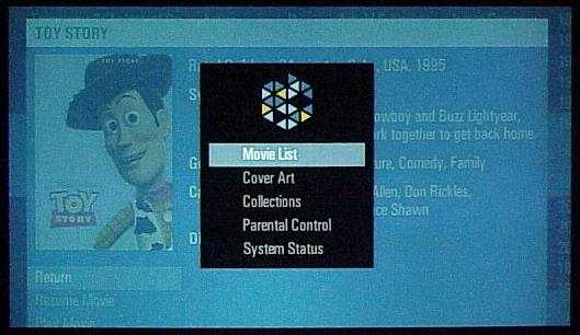 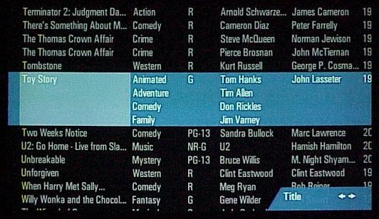 But then there's Moxi, which just seems to be about "perfect" IMO. Just clean, polished, professional UI. Starting with my favorite thing, the timebar: About 100x better than Sage's monstrosity.  Overall, if we could get Moxi's UI on top of Sage's core, I think a lot of people would be very happy. Though probably pass on the cross-bar guide
|
|
#5
01-01-2009, 08:28 PM
|
|||||
|
|||||
|
Quote:
Quote:
Quote:
Quote:
Quote:
Last edited by evilpenguin; 01-02-2009 at 03:13 PM.
|
|
#6
01-01-2009, 09:36 PM
|
||||
|
||||
|
My main quibble with STV Main menu is that I don't care for having videos (from DVDs and legal online sources) separated from recorded TV. I would love to have it all in one area so that it's easier to access. Oddly most of my movies are under recorded TV (HD movies have far better PQ than DVD movies) and my TV series are under Videos (ripped from DVDs).
At least the Search function finds everything. Still looking for a plugin to merge all my video files but haven't found one yet.
__________________
Server: Windows 8x64, ASUS P8 H67-M Pro Micro ATX, Core i5, 8 RAM, 14TB running latest Sage Clients: HD200, HD300, Win7 Desktop Capture Devices: Hauppauge Colossus & 1 HDHR, TV Service: Verizon FIOS
|
|
#7
01-01-2009, 09:47 PM
|
||||
|
||||
|
Quote:
|
|
#8
01-02-2009, 12:02 AM
|
|||
|
|||
|
Quote:
Quote:
|
|
#9
01-02-2009, 03:59 AM
|
||||
|
||||
|
Quote:
I miss this functionally.. The nBlue theme for SageMC is simular to this, but no where the same as far as the "feel" from VMC..... Also miss the Sports menu, oh well.. Also, why use nBlue theme and not the default theme for SageMC?? Wouldnt that make a comparison like this more legit?? I mean after all, it is a plugin of a plugin...
|
|
#10
01-02-2009, 04:16 AM
|
||||
|
||||
|
I would like to add that i really like the SageMC with the CenterSage theme, and have been using it exclusively for a while now. Very clean, minimalistic approach, Large icon based, with tect helpers. (I do wish the text stuck with the non-selected icons though).
__________________
Buy Fuzzy a beer! (Fuzzy likes beer) unRAID Server: i7-6700, 32GB RAM, Dual 128GB SSD cache and 13TB pool, with SageTVv9, openDCT, Logitech Media Server and Plex Media Server each in Dockers. Sources: HRHR Prime with Charter CableCard. HDHR-US for OTA. Primary Client: HD-300 through XBoxOne in Living Room, Samsung HLT-6189S Other Clients: Mi Box in Master Bedroom, HD-200 in kids room
|
|
#12
01-02-2009, 07:17 AM
|
||||
|
||||
|
Quote:
My point is, if you like the current stock ui, then why? And, to keep the thread on topic, could you frame your answer in terms of design and not other mitigating factors like development cost, alternative UI's, etc?
|
|
#13
01-02-2009, 07:32 AM
|
|||
|
|||
|
Quote:
|
|
#14
01-02-2009, 07:50 AM
|
|||
|
|||
|
Look...these threads pop up every week...after week...after week. If it was in the Customization or SageMC category, I probably wouldn't have even posted. But in the General area, to me, is like waiving a flag to the stock UI loving users. (which is fine, see below).
It's an internet board, I get it. I love reading every post (and I have no problem with EvilP or anyone else, hugs to all) but when I have a different take, I reply. What do I like about the stock UI...I don't know, what do I like about Heidi Klum?...the overall package works for me. Sage knows by now, the score of lovers to haters...they'll do what their going to do. Again, love all around, I just wanted to reply with a differing POV. P
|
|
#15
01-02-2009, 08:10 AM
|
||||
|
||||
|
Quote:
|
|
#16
01-02-2009, 08:11 AM
|
|||
|
|||
|
This looks to be a fascinating thread.
To the Stock UI lovers: Just read the title... it's one man's opinion on the downside of the UI... and the discussion will center on that - the down side. Sure, there are many, like you, who are happy with things the way they are... fine. And nobody here has a real right to question your motivation. Opinions are just that. But let's keep it simple. You've stated your opinon. Now discuss why... not just keep re-stating that opinion.
__________________
<============= Jim White Treasure Island, FL
|
|
#17
01-02-2009, 08:24 AM
|
|||
|
|||
|
Quote:
Quote:
Last edited by S_M_E; 01-02-2009 at 08:30 AM.
|
|
#18
01-02-2009, 09:06 AM
|
||||
|
||||
|
I'm excited about the second part of this thread (where we'll actually go into details about evilpenguin's dislike of other screens in the SageTV stock ui), because I have some basic polishing peeves on those screens, but for now, let me limit my comments to just the main screen.
Why does the highlight bar highlight 3/4 of the way across the screen? I think ep already pointed out the dead space on the main menu, but I'm curious as to why you would only choose to highlight part of the screen. Granted, it's wider than all of the characters on the selection choices, but yet it's not full screen. One of the things that I did notice looking at the other options is that very few of the other UI's offer more than five textual choices at a time; icons represent the little used options instead. (BTW, stanger, is there an equivalent main menu for Moxi?) My general reaction to the main page is there's too much stuff there; when I enter my PVR system, I mostly want to Watch something, or Listen to something. I may occasionally need to adjust Settings, but not often.
|
|
#19
01-02-2009, 09:33 AM
|
|||
|
|||
|
Quote:
 I agree... the main menu should (by default) contain the paths or tasks that the casual user would care to excercise, not the administrator. Quote:
__________________
<============= Jim White Treasure Island, FL
|
|
#20
01-02-2009, 09:56 AM
|
|||
|
|||
|
Quote:
Quote:
|
|
| Currently Active Users Viewing This Thread: 1 (0 members and 1 guests) | |
|
|
 Similar Threads
|
||||
| Thread | Thread Starter | Forum | Replies | Last Post |
| STV Import: Dynamic Customisable Main Menu (v6.4 20/Dec/2007 for SageTV 5.0/6.0) | nielm | SageTV Customizations | 555 | 07-09-2014 06:36 PM |
| Using the default STV in Custom STV Mode from custom STVs (v6.4 & later) | Opus4 | SageTV Studio | 49 | 09-23-2011 05:50 PM |
| SageTV V6.3.2 Beta is Available! | Narflex | SageTV Beta Test Software | 0 | 11-21-2007 07:08 PM |


 Linear Mode

