
|
|
|||||||
| General Discussion General discussion about SageTV and related companies, products, and technologies. |
 |
|
|
Thread Tools | Search this Thread | Display Modes |
|
#21
 01-02-2009, 10:05 AM
|
||||
|
||||
|
Quote:
Its kind of a impasse. Put the resources into a new UI, but upset the ones who don't want change, keep up both but thats more work when new items are added in the future, or keep it as it is, and deal with the people who want more. 
|
|
#22
01-02-2009, 10:16 AM
|
||||
|
||||
|
I tend to agree with most points of the OP, which is why I went for a slightly modified version in my MainLobby plugin. Adding some little existing icons, a description of the selected menu item, and filling that void on the right... Replace "Monitored device" by Setup and add back things like "Online services" and you get the idea... There's no bling in there, it just about clarity and efficient use of the space...
__________________
SageTCPServer (2.3.5): Open source TCP interface to the SageTV API MLSageTV (3.1.8)/Sage Media Server (1.13): SageTV plugin for MainLobby/CQC TaSageTV (2.58)/TaSTVRemote (1.14): Monitor/control SageTV with an Android device TbSageTV (1.02)/STVRemote (1.11): Monitor/control SageTV with a PlayBook 2 TiSageTV (1.64)/TiSTVRemote (1.09): Monitor/control SageTV with an iPhone/iPod/iPad
|
|
#23
01-02-2009, 10:29 AM
|
|||
|
|||
|
I agree with a lot of things in the original post. Though I hate the animations. The first thing I do whether it's SageMC or the default stv is disable them. The 2nd thing I do is customize the menus to remove things such as live TV and rename the recordings and a few other menus. Overall I like the functionality of the default STV, but it would be nice if it were tweaked a little.
|
|
#24
01-02-2009, 11:03 AM
|
||||
|
||||
|
Quote:
For the record, I'm not a big fan of the stock UI either visually or functionally, and I don't use it much except for configuration. I don't use SageMC either (I think the word "My" ought to be banned from UI design for at least five years). I use a custom UI that I built myself; here's what my Main Menu looks like:  The items in the right panel change depending on which left-panel item is selected (much like the stock UI's Detailed Setup screen), thus collapsing the functions of four or five stock UI screens into one menu. There are some configurable transition effects (fade, scroll, slide, spin, etc.) in how the right panel changes its contents; that's the only bling to speak of. The snowflake watermark is configurable and I change it seasonally. Personally I have no problem at all with the fact that this menu is all text and has the words "Main Menu" at the top. My goal with this design was not to blow anybody's mind or keep up with the competition but to group functions logically and make efficient use of screen space while keeping things clean and simple and easy to understand.
__________________
-- Greg
|
|
#25
01-02-2009, 11:26 AM
|
||||
|
||||
|
Quote:
"I like it" "Why?" "Because it's cheap, and if you like something else, there's addons for that". "OK, but aside from that, what do you like about the stock ui?" "I like it" "O.k.... Why?" "Because it's cheap, and if you like something else, there's addons for that". "O...K.... Assume that changes are free, and that you could have anything in the world, would you still use the stock UI?" "Yeah, cause I like it." "Why?" "Because it's cheap, and if you like something else, there's addons for that".  I was just trying to delve deeper than that, but apparantly some people mistook that for an attempt to push them out of the conversation. Rather than continuing to argue the point, I thought I would simply state my own opinion about what I dislike about the stock ui. Also, just to clarify, good design is not just about graphics and/or animations; it should also include strong navigation and consistency. But since we're just talking about the main menu, we're a bit pigeonholed. Quote:
") Quote:
|
|
#26
01-02-2009, 12:00 PM
|
|||
|
|||
|
Even though I'm part of the "Bling Brigade" as its been put I do rather like the look of GKusnick UI. Clean, simple and to the point.
In my mind GKusnick UI is what Sage should be aiming for. Just my opinion 
__________________
Server - Win7 64bit, 2.4Ghz Intel Core 2 Duo, TBS 6284 PCI-E Quad DVB-T2 Tuner, 3 x HD200 & 1 x HD300 extenders
|
|
#27
01-02-2009, 12:24 PM
|
||||
|
||||
|
Quote:
"What don't you like about the stock UI?" "It looks dated." "OK, but what does that mean exactly?" "You know, not enough bling." "Fine, but what do you mean by bling?" "You know, flash, sparkle, pizazz." "All right, but what specific changes would you make to improve it?" "I'd add more bling, make it flashier, bring it up to date." And around and around. For what it's worth, a while back I did create a theme for the stock STV that captures some of the feel of my custom UI (but not the functional layout, obviously), and that's what I use when I resort to the stock UI for configuration and such.
__________________
-- Greg
|
|
#28
01-02-2009, 12:39 PM
|
|||
|
|||
|
GKusnick,
I like that UI simple and Easy. I would like to use it on my laptop client. Any chance of posting it?
__________________
Channels DVR UBUNTU Server 2 Primes 3 Connects TVE SageTV Docker with input from Channels DVR XMLTV and M3U VIA Opendct.
|
|
#29
01-02-2009, 12:58 PM
|
||||
|
||||
|
Quote:
__________________
-- Greg
|
|
#30
01-02-2009, 01:35 PM
|
||||
|
||||
|
Quote:
 But, as you say, its never more than generalities like "omgz, I hate it!" vs. "omgz, I love it!" and eventually it dissolves into chaos to the point where the thread just dies off, which is a shame because I think there are things that need to be discussed. The reason I'm getting into this level of screen specifics and not talking about the STV as a whole is that I hope I can encourage people to discuss the gray areas between dismissive statements like "omgz, I love it!" and "omgz, I hate it!". I know I personally don't hate it! There's *a lot* of stuff I do like about it and I'll get to that when I talk about those screens (ex: Imported Videos). But, there's also a lot of little/big stuff that just drives me *crazy* and I wanted to call those out too. Its OK to say, "I like the default STV... but this thing here bugs me". I do regret how I named the thread, its very combative and I didn't mean for it to be. I wrote the title when I first sat down to write the post and didn't think to change it before I posted. I also don't like how it sounded like I was comparing the default STV to those others screens. My intention was to just to show which of my specific complaints were addressed in other packages. I may still edit that section a bit to reflect what I was going for. P.S - I also call for a ban on the word "Bling" in this thread 
Last edited by evilpenguin; 01-02-2009 at 01:44 PM.
|
|
#32
01-02-2009, 01:58 PM
|
||||
|
||||
|
I'm one of those stuck somewhere in between the default STV and SageMC.
I like the TV menu in SageMC but I should save that for the next thread! What I like about the SageMC main menu is that you can change it. I personally have the options TV Videos Music Pictures Play DVD I've removed the 'My' from everything and left aligned them. If I had a wife I'm sure she'd insist on it saying 'Her' in front....... The thing I don't like about the setup or 'my menu' item is that as soon as a friend comes round the first thing they do is go 'what I can change in there...' There has to be a setup option and it would make sense to have it on the main page. Maybe the options button or something like that could bring up the option for the setup. I also like having the weather on the page. When its not there you don't miss it but I can't count the number of times its made me think about putting another jumper on or leaving the house a few minutes earlier to defrost the car. Just my rambling thoughts. EDIT: Oh yes, I prefer TV recordings seperate from videos. TV recordings tend to be volatile where stuffs always changing, whereas my videos are usually going to hang around for quite a while and will have jpg files associated with them.
|
|
#33
01-02-2009, 02:11 PM
|
|||
|
|||
|
Quote:
/end hijack
__________________
Server: Rosewill RSV-L4411 server case, Core i5 4590, 16 GB RAM, 1 Hauppauge Colossus, 1 HDHomeRun, 500GB SATA recording drive, 14 TB JBOD for media, SageTV 7, Win7 Pro, Ubuntu 14.04 VM with Plex Server and Subsonic Frontend: ASUS Chromebox running Kodi with SageTV add-on Last edited by aaronb; 01-02-2009 at 02:15 PM.
|
|
#34
01-02-2009, 02:11 PM
|
||||
|
||||
|
Quote:
Quote:
Last edited by evilpenguin; 01-02-2009 at 02:13 PM.
|
|
#35
01-02-2009, 02:24 PM
|
||||
|
||||
|
Good post - well thought out. I'm also a default user who's tried MC for awhile without success and desperately hope SageTV 7 brings some UI improvements.
Quote:
Quote:
I think "white space" can not be forgotten in this area. Worse than too much empty space is clutter. Quote:
- right on! But no matter what happens on this front, you'll need to pry nielms dymanic menus from my cold dead hands.
|
|
#36
01-02-2009, 04:21 PM
|
|||
|
|||
|
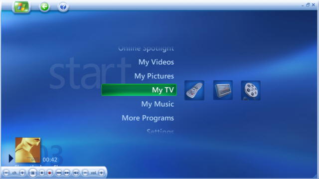
Sorry to come in late but I think you sold short the XP MCE Main Menu. It dynamically adds different items depending on what element you are on - in the image I have posted shows what happens when you have scrolled down to My TV - it gives you different functionality that you can directly go to by moving over to the icons that are to the right of My TV. The icon of the remote lets you go directly to RecordedTV, the TV icon takes you to LiveTV and the movie reel icon takes you to Movies. You also get a now playing window in the bottom left corner. This is much more functionality than the stock Sage UI. It's also a cleaner look in my opinion.
 But to get back to the main topic - I too am somewhat between the stock UI and SageMC. But there are some things that totally bug me - the Recording Detail screen has too much on the screen at once with now differentiation between titles (like Starring) and the actual data. (See below). This screen is too ambitious and tries to put too much on the screen at once. The other thing annoying about the stock UI is that it brings up too many menus by default - when you click on a TV show name it makes you click again to Browse Recordings - I turn this off ASAP. 
__________________
New Server - Sage9 on unRAID 2xHD-PVR, HDHR for OTA Old Server - Sage7 on Win7Pro-i660CPU with 4.6TB, HD-PVR, HDHR OTA, HVR-1850 OTA Clients - 2xHD-300, 8xHD-200 Extenders, Client+2xPlaceshifter and a WHS which acts as a backup Sage server Last edited by wayner; 01-02-2009 at 04:31 PM.
|
|
#37
01-02-2009, 04:34 PM
|
|||
|
|||
|
EP: As some others have said, good post and good thread!
Okay first things first: I'd be willing to sign a petition banning the use of the word "My" in media center UIs forever! Every time I see "My TV" I think "well what else am I gonna do, watch someone else's TV?"  Another thing I'll throw out is I think it makes sense to separate functional aspects of the UI (this would mostly include verbiage) from visual aspects. Obviously there's some overlap, but I think the two categories address fundamentally different aspects of the UI. On the functional/verbiage side, I agree with a lot of what EP had to say. "Live TV" to me is useless, IMHO it should be labeled "I want to watch something on TV but I don't care what" which at least for me is never the case. I also agree "media center" is confusing. My wife is a smart computer-literate person who, unlike me, has not spent 100's of hours screwing around with Sage. And I wish I had a nickel for every time she's asked me "How do I get to movies?" IMHO things would be much better if the 2nd item on the menu was "Movies & videos" and the 3rd item was "Music".On the visual side (what we all don't want to call "bling"  ), I'm on the fence. I'm pretty jaded when it comes to computer stuff and I think for the most part I can see through eye candy and form my opinions based on how a product actually works. However I must confess, when reading the 1st post in this thread, I was really captured by the XBMC screenshot. ), I'm on the fence. I'm pretty jaded when it comes to computer stuff and I think for the most part I can see through eye candy and form my opinions based on how a product actually works. However I must confess, when reading the 1st post in this thread, I was really captured by the XBMC screenshot.I think even with experienced computer users there's a tendency when presented with something visually appealing to think that if a vendor put that much effort into the visuals, they maybe put equal effort into functionality. Or in other words, "if it looks good it must work good". Obviously not necessarily true, but I think to a certain extent it's human nature to be influenced that way. The other important area, and where I think the above effect becomes more important, is when other people are brought into the equation. Certainly some Sage customers are going to be sole users. But others have wives/husbands/parents/roommates/children/rich uncles/??? who also use their Sage system and whose opinions of Sage are important (especially if they have influence over spending  ). I'm going to go out on a limb and guess that most of these other users are not as experienced with computers as the "system owner", not as experienced with Sage, or most likely both. And IMHO people who fall into those categories are more likely to be influenced by appearance, if only in the sense of making a good "first impression". I know that's been very true in my case, my wife never showed much interest in Sage when I used the stock UI, but she's shown a lot more since I switched to SageMC! ). I'm going to go out on a limb and guess that most of these other users are not as experienced with computers as the "system owner", not as experienced with Sage, or most likely both. And IMHO people who fall into those categories are more likely to be influenced by appearance, if only in the sense of making a good "first impression". I know that's been very true in my case, my wife never showed much interest in Sage when I used the stock UI, but she's shown a lot more since I switched to SageMC!
__________________
Be alert! America needs more lerts. Eric Law
|
|
#38
01-02-2009, 05:05 PM
|
||||
|
||||
|
Quote:
Quote:
Quote:
Last edited by evilpenguin; 01-02-2009 at 07:30 PM.
|
|
#39
01-02-2009, 06:02 PM
|
||||
|
||||
|
Great topic! I've been involved in the PC industry since the 80's and have to agree with most/all of your points. Since I come from a hardware/technical point of view, I've never really thought about what I didn't like with the stock UI, I only knew that it felt dated.
All it took was your two screenshots of the Sage main menu and the one made in text and, WHAM! the little lightbulb above my head popped on. It reminded me of an ERP package that I installed in the 90's at a manufacturing company that I work for. The original version was a text only, green screen application. The ERP vendor made a big deal about their "new and improved" gui version. But all this "new and improved" version really did was screen scrape the text screens and enclose it in a window. You couldn't even resize the windows, they were stuck in a fixed size. Several years later, the vendor finally started to completely rewrite the screens to act and behave as a real windows application. I hope that somewhere down the line the SageTV devs will realize that "sizzle" does sell, and will update the gui. When introducing SageTV to the wife, I also found out that switching to SageMC increased the WAF significantly.
|
|
#40
01-02-2009, 08:54 PM
|
|||
|
|||
|
I'd really like to see the dynamic menus made part of the stock UI. And a weather icon with current conditions right on the front page like SageMC (or HD200 I think). Those are my biggest complaints for the main screen.
When I turn on the TV, I want to see how much disk space is being / will be used, the current weather, and a menu that matches what I do most so it's just one click away and stuff I never do is gone. Since everyone will have different ideas of what options should be on the main menu, why not make it customizable right out of the box? The graphics are dated, but first I'd like the menu customization things officially supported and available as soon as a new release comes out.
|
|
| Currently Active Users Viewing This Thread: 1 (0 members and 1 guests) | |
|
|
 Similar Threads
|
||||
| Thread | Thread Starter | Forum | Replies | Last Post |
| STV Import: Dynamic Customisable Main Menu (v6.4 20/Dec/2007 for SageTV 5.0/6.0) | nielm | SageTV Customizations | 555 | 07-09-2014 06:36 PM |
| Using the default STV in Custom STV Mode from custom STVs (v6.4 & later) | Opus4 | SageTV Studio | 49 | 09-23-2011 05:50 PM |
| SageTV V6.3.2 Beta is Available! | Narflex | SageTV Beta Test Software | 0 | 11-21-2007 07:08 PM |


 Linear Mode

