
|
|
|||||||
| General Discussion General discussion about SageTV and related companies, products, and technologies. |
 |
|
|
Thread Tools | Search this Thread | Display Modes |
|
#101
 01-08-2009, 04:08 PM
|
||||
|
||||
|
I've enjoyed reading through this entire thread and wanted to jump in with my thoughts:
1. The stock STV has too many options on the main menu which don't "apply" to casual users. Why would someone using Sage want to put it into Standby? Why would the casual user need to go into Setup? 2. The main menu should allow me to get to WHAT I want with as FEW clicks as possible. To that end, music, photos, and TV should absolutely be on the main menu. Perhaps not named as simply as that, but you get the idea. I actually liked the "What's on TV now?" idea and just prior to reading that post, I was thinking about renaming my own "My TV" item to "What's on?" or "Let's watch...". This also brought back my Tivo days and I recalled "Now Playing" and I kinda like that again. 3. The main menu needs to be customizable, since you can't please everybody. But, it needs to stay clean and usable. To that end, the disk space should not be there by default (as someone else mentioned) since the casual user doesn't need to worry about that. I press the INFO button to make it appear when I want. 4. The fullscreen icon shouldn't be there. On the off chance you really want to go to windowed mode, you're about to be using the mouse and keyboard anyway, so you may as well use the shortcut keys. 5. The current weather seems like a logical addition to the main menu and would get rid of the overabundance of unused space. 6. I don't see a reason to have "Main Menu" on the... main menu. It should be intuitive enough to begin with. Something as simple as the SageTV logo or, like the Logitech remotes call them, "Activities" seems more appropriate. I'm really torn on the rest of the main menu, since we need to go to a different screen to access less frequently used items (i.e. Online Services, RSS, MovieTimes, Setup, etc.). But, how do you get there and what do you call the menu item? "My Menu" is pretty lame and doesn't sound like where you'd be going to make major functionality changes (i.e. Setup). I'm thinking it should be a "More" or "Advanced" menu item or something along those lines. I'll have to post a screenshot of how mine is configured, but it's similar to mkanet's first image here. I have the upcoming and recent recordings in the upper left corner, stacked on top of each other, and the weather in the lower right corner. EDIT: Here's my Main Menu... Last edited by Skirge01; 01-08-2009 at 11:19 PM. 
|
|
#103
01-09-2009, 11:38 PM
|
||||
|
||||
|
I've been giving some thought recently to what I like about various htpc interfaces.
I must say that I was quite taken by the VMC interface when I first saw it, particularly with the fact that it's crossbar navigation allows you to access more items directly from the main menu without too much clutter. It also remembers which sub-category of naviagation you last used and brings you back to that when you're scrolling throught the options vertically. I have an unused install on my work laptop and fired it up for inspiration. On re-visiting it I find that my initial enthusiasm has waned somewhat. One thing that I realy do like about the VMC interface is it's heavy use of thumbnails in the interface (though not so much in the main menu). SageMC has a bit of this going on and I think there's opportunity for more in the interface when it's time for E.P. to fire up that thread. What I would like to see in a main menu system is more of what's on my system. I look at the main menu <banned word>bling</banned word> in xbmc posted above and have always thought something along the lines of "Woot! A picture of someone's loungeroom". It doesn't realy help with the navigation or give me any additional navigation support and could get old fast (imho). Because the remote navigation buttons have two dimensions I think a main menu ought to make use of these to allow for sub selections in groups like the VMC navigation. I've put together some mockups below of a slightly re-designed main menu which uses vertical navigation to select major categories and horizontal navigation to select sub categories within that group. When scrolling vertically the last selected horizontal options are persisted. The screens displayed in the content panel would not be navigable from the main menu. Selecting an item from the main menu would zoom/switch to that view full screen (with some cool animated reveal/slide/zoom effects no doubt). The view showed would be representative of the state of that particular menu item. E.g. If I am scrolled half way through the album view of my music collection and it's currently sorted by album artist, then that's what will appear in the content pane when I select Music/Album on the menu.       What do you reckon? Mick. Edit: Oooh. And animated slide effects so that when you move up down/left right the content panel scrolls up and down left and right to give the effect of being a window moving about between screens... Last edited by mickp; 01-09-2009 at 11:44 PM.
|
|
#104
01-09-2009, 11:50 PM
|
|||
|
|||
|
Hello Mick,
very interesting effort. As a user of the stock GUI, there is one thing that I find really confusing about the stock GUI and I see the same issue in your mockup. The items which have focus and represent your current location are located in different parts of the screen and have no seemingless connection between them. E.g in your last mockup the Music and Now playing are so separated it is hard to see connection between them. It always confusing me when by some chance I get to the tabbed menu to find where I currently am and what element has the focus. Another thing I dont like about the stock GUI and I see it on your mockups is the amount of vasted space for not very useful elements. E.g. you mockups with thumbnails selections. I would much rather see bigger thumbnails or more of them then the large Videos/Music/Etc. especially since the current place is already highlighted on the left. Think about user. User is there on the screen not for the "bling" but to easily find the item he wants to access. Otherwise the mockups are very nice and you have obvious talent.
__________________
TV: Samsung UN46D8000 Server: Intel Core i3 540, 4G RAM, Matrox G450, 70GB EXT3 encrypted software RAID1 system drive, 1TB XFS tv recording drive, 2TB EXT3 encrypted data drive mirror across 2 machines, 2TB EXT3 encrypted media drive mirror across 2 machines, CentOS 6 64 bit, Experimenting with DNLA servers 1Gb wired network Disconnected after G day[HD 100 Media Extender, Placeshifter 7.x, SageTV 7.x, HDHomeRun]
|
|
#105
01-10-2009, 01:14 AM
|
||||
|
||||
|
Quote:
Another option that I've considered is making an lcars like line/bar between the two items and making it run underneath the transparent elements of the screen being displayed. eg: Code:
TV
Videos
Music -------------------------------------
Pictures                                   |
More                                       |
          Album     Artist   Playlists  Now Playing
LCARS elements just seem too tacky to contemplate seriously though. Perhaps this could be the first useful imlementation tho  I'm also not sure how easily this could be implemented in Studio. Regardless I'd recommend against heavy deployment of lilac or burnt sienna in the interface I'm also not sure how easily this could be implemented in Studio. Regardless I'd recommend against heavy deployment of lilac or burnt sienna in the interface Adding the submenu to the title so that rather than "Music" it says "Music/Album" might also help a bit. I think that after navigating about a little the user would get it. I think that the scrolling effects that I mentioned as an edit on the post would also help to give the users a "sense of place" within the interface Quote:
The addition of a further visual cue given the comments re: disconnection of the vertical and horizontal elements seems justified. Perhaps scaling them down would do the trick? Quote:
Mick.
|
|
#106
01-10-2009, 09:31 AM
|
||||
|
||||
|
Quote:
I like how the selection item from the horz bar pops out at you (This is a SageMC option - right?). The layout in general still reminds me of the default - a bit 2Dimensional. I think it would help by creating a more distinctive looking header bar. I'd also suggest moving the SageTV icon & power button into that header bar. The most important thing I think you show it the dual selection areas. This would change the way navigation is performed from the main menu by making the right arrow key no longer 'select' the item. Does MC currently allow placing multiple selection areas on a single screen? Quote:
|
|
#107
01-10-2009, 10:31 AM
|
||||||
|
||||||
|
Thanks heaps for your feedback Wado1971. Much appreciated.
Quote:
I can't help thinking that you're cutting off your nose to spite your face by trashing persistence of the horizontal menu tho. By maintaining the most recent selection theres a definite chance that even if the defaults don't suit you (e.g. other family members) you'll have a comfortable session because your preferences are at least maintained once you've swapped to/used them. Hopefully it's not rocket science nor a huge effort to move between the horizontal screens if you've arrived at one that doesn't suit. Quote:
Quote:
Please feel free to contribute your own designs re: graphics. I'm happy to admit/promote that i'm no Graphic Designer and that others should make it look good. Quote:
Quote:
Quote:
Mick.
|
|
#108
01-10-2009, 12:14 PM
|
||||
|
||||
|
Quote:
Quote:
Quote:

|
|
#109
01-10-2009, 03:29 PM
|
|||
|
|||
|
Hello,
Snazzy! I have some concerns with the two navigational areas though. If you're using this interface on an extender (so with a remote), how would you choose from among the view types? On the standard STV (I use SageMC, which isn't set up like that.), I usually forget that you have to be in the left side control panel and then press up to get to change the views. It always confuses me when I'm in the media list and press up and the list scrolls (or especially if I'm at the top of the list and it scrolls to the last item of the list). I forsee that same issue here. How often do people really change their view for a particular media type? I have my favorites (video: file system then list view; recorded TV: sorted by most recent; music: by artist; photos: by date) and I don't think I ever change the view (at least on purpose  . .Thanks. Todd
|
|
#110
01-10-2009, 03:32 PM
|
|||
|
|||
|
Quote:
In addition, there should be a way for replacement STVs (like SageMC) that have their own complimentary settings, to either fit into the default settings structure or import the options and display them in a better format.
|
|
#111
01-10-2009, 03:36 PM
|
|||
|
|||
|
I’ve advocated for an updated UI of Sage for a while, but truth be told, I find it very functional. I don’t find it particularly aesthetically pleasing, but I have a hard time coming up with a specific description of what I’d like to see. I think evilpenguin started off this discussion in a really good way, by providing some examples and saying what he did and didn’t like.
First of all, I really like the main menu in nBlue, although I’d say that bialio’s screenshot looks nicer than that one used in the first post. Here’s what he had: 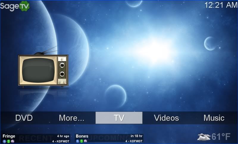 It’s a pretty clean design, and users aren’t being bombarded with lots of information. As the same time, it does show recent and upcoming recordings, and weather, in a very low key way. I also like the basic design of gplasky’s Sage pro MC Theme:  Again, I think this one displays the menu, and extra information (e.g, weather and recent/upcoming recordings) without making it too overwhelming. I like the idea of the side panel, although I’m a little concerned that it just wouldn’t work with 4:3 AR displays. Also, I don’t think it looks as good when there isn’t a video or music file playing in the top of the side panel. I think it would look better with either some sort of placeholder, or by moving the recent/upcoming records items to the top of the panel. Earlier in this thread people discussed whether or not the main menu should show this information. As was previously stated, it’s really a matter of preference. My preference is to include that information, as long as it can be done in a way that doesn’t make it look cluttered. I know that’s another subjective statement, but I think Sage Pro MC and nBlue themes do a pretty good job of that. My main reason for wanting that information is that, of all the screens, the main menu is probably the only one where I’m likely to spend any amount of time without doing anything. If I’m in the recordings or video import screens I’m probably doing to be scrolling through the various files. But, when I first turn on Sage, there might be a couple seconds where I’m not doing anything except trying to decide between watching TV, watching an imported movie, or listening to music. I think seeing recent recordings, or shows on in the near future, would be helpful. It’s for me to say much about aesthetics, but there is one thing that’s sort of bugged me about both the Sage UI and Sage MC. I think in some places they’re too “boxy”. For instance, I don’t like the grid of boxes in the video imports menu. More generally, I don’t like how most of the menu options in SageMC look like little buttons. I’d rather have them just be text (or icon/thumbnail) options, highlighting them somehow when you select them. Since it’s hard to read text on top of a background, sometimes it might be desirable to not just put them directly on top of the background. In those instances, I’d rather have all the menu options in one box, than each one in its own little box. For instance, nBlue had that continuous strip that goes across the window, rather than 5 little boxes slightly spaced out.
|
|
#112
01-10-2009, 06:03 PM
|
||||
|
||||
|
Quote:
Mick.
|
|
#113
01-10-2009, 06:34 PM
|
|||
|
|||
|
Quote:
Greg
|
|
#114
01-10-2009, 07:48 PM
|
|||
|
|||
|
Greg, you are absolutely right, That is the main problem of the standard UI for me and that is how do you get from the media to menus and back. It is always confusing, because when browsing the media sometimes I push left or right one too many times and I end up somewhere in menus or tabs.
__________________
TV: Samsung UN46D8000 Server: Intel Core i3 540, 4G RAM, Matrox G450, 70GB EXT3 encrypted software RAID1 system drive, 1TB XFS tv recording drive, 2TB EXT3 encrypted data drive mirror across 2 machines, 2TB EXT3 encrypted media drive mirror across 2 machines, CentOS 6 64 bit, Experimenting with DNLA servers 1Gb wired network Disconnected after G day[HD 100 Media Extender, Placeshifter 7.x, SageTV 7.x, HDHomeRun]
|
|
#115
01-10-2009, 08:11 PM
|
||||
|
||||
|
Quote:
Pressing ok on the remote would take you to that screen. Quote:
|
|
#116
01-11-2009, 01:06 AM
|
||||
|
||||
|
Quote:
Just my two cents. Nick
|
|
#117
01-11-2009, 05:21 AM
|
||||
|
||||
|
Quote:
What's so confusing? I think "Hmmmn. There's the thing that I want! What will I do? Press left 5 times realy quickly? No! that didn't work! Bah. What if I mash the Info button extra hard? Nope that didn't work  . Maybe if I type my credit card number in using the keypad... nope. No response. Stupid interface!!!1!". . Maybe if I type my credit card number in using the keypad... nope. No response. Stupid interface!!!1!".Mick.
|
|
#118
01-11-2009, 04:48 PM
|
||||
|
||||
|
Judging from your tone, it seems you didnt really want feedback, but I'll reply to your "questions" anyhow.
Quote:
Quote:
Nick
|
|
#119
01-11-2009, 05:10 PM
|
||||
|
||||
|
The big issue I see isn't the two directional navigation scheme, it's that looking at the screen, it's not at all clear that you're controlling both lists at the same time, where your control focus is.
I think 2D nav can work well for the main menu, where there are lots of places you may want to go directly. But also you can easily colocate the two dimensions of control (either X-bar type or flyout type) so it's completely clear where your control focus is. But on sub/info screens I don't think it works very well. I think there you want just a simple 1D scheme. The other thing I wanted to bring up (this is more general) is the idea of having multiple control "zones". From a remote-driven UI perspective, this is a really bad design. The stock UI adopted this for the media screens, and I saw some conceptual pictures posted above as well. I for one really don't like these, they're really hard to get around, because you sort of have to "find" your way out of one area and into the others. Such design is great for mouse use, because you can easily put the mouse wherever, but for a remote (up/down/left/right/select/back) nav it can be rather frustrating.
|
|
#120
01-11-2009, 06:44 PM
|
|||
|
|||
|
I have started to write this post 4 times this weekend.
Too many things going on.The one thing that this thread has really pointed out to me is that I really like SageMC now that I know you can customize the main menu. I like the "life" status it gives me, I like the nice balance between the media and the ease of use. I have the following for my main menu items: TV Recordings Videos Music Pictures Online Videos Settings The one thing I might explore is sagemc pro. I like the screen elements (well, I would turn off the RSS feed) but I don't like the cartoon graphics. I much prefer the more "sophisticated" default graphics of sagemc. Hey EP, what is the next question in the series? Greg
|
|
| Currently Active Users Viewing This Thread: 1 (0 members and 1 guests) | |
|
|
 Similar Threads
|
||||
| Thread | Thread Starter | Forum | Replies | Last Post |
| STV Import: Dynamic Customisable Main Menu (v6.4 20/Dec/2007 for SageTV 5.0/6.0) | nielm | SageTV Customizations | 555 | 07-09-2014 06:36 PM |
| Using the default STV in Custom STV Mode from custom STVs (v6.4 & later) | Opus4 | SageTV Studio | 49 | 09-23-2011 05:50 PM |
| SageTV V6.3.2 Beta is Available! | Narflex | SageTV Beta Test Software | 0 | 11-21-2007 07:08 PM |


 Linear Mode

