
|
|
|||||||
| Phoenix This forum is for discussing the user-created Phoenix custom interface for SageTV. |
 |
|
|
Thread Tools | Search this Thread | Display Modes |
|
#1
 03-14-2011, 07:57 PM
|
|||
|
|||
|
UMB thoughts/ideas/defects/enhancements
I think folks that have seen my other thread saw some of my notes on the umb. But I wanted to start a new thread for everyone else to comment. For now I'll just add two things to start the conversation...
1. I think the umb is really on the only thing in this outstanding STV that just doesn't seem done or up to the quality level as other parts the stv. I'm thinking this is known and the team just hasn't gotten to it yet. The different ways to present your content is what I think Diamond did get right and the bar has been set for the community in that regard. I think we would have to at least support the same kind (not exact have to maintain the phoenix identity) of views. 2. Use of banners. The general consensus most other media centers(xbmc,plex,boxee,etc..) are that banners for tv is long in the tooth and most have moved to use posters. I think the sage community is a little behind on this. One main advantage is that you can use the same display paradigm with both movies and tv if we move to using posters instead of banners (for the most part) 
|
|
#2
03-14-2011, 08:15 PM
|
||||
|
||||
|
I agree with #1 and would like to add #3 online content. If we can get the online content/netflix/hulu integration through the use of EP's plugin that would be awesome.
as for the UMB, im not exactly sure yet what i would change or what i would add exactly. I have been using Phoenix as my primary stv now since the private beta came out, and i always have ideas, but none of them so far have been note worthy. What sort of ideas do you have Gustovier?
|
|
#3
03-15-2011, 08:52 AM
|
|||
|
|||
|
I currently like the double list UMB.. I find the design and the way it brings up the detail page in a centered floating box both aesthetically pleasing and refreshing.
Things that I find that I'm not big on: 1 - When a TV series is displayed on the left side, it shows the # of shows I have. Why? I don't see the need for this info. It provides no useful information. 2 - When an episode is listed on the right side, the "Watched" icon is left-aligned with the first letter of episodes not watched. I think it would look cleaner if the watched icon was in it's own column, and all of the episode titles were aligned regardless. Grant
|
|
#4
03-15-2011, 10:21 AM
|
|||
|
|||
|
So nobody likes a complainer that doesn't propose solutions (I know i dont..lol)
 So I think what the UMB is trying to achieve is a bunch of views that would work with BOTH Movies and TV (let me know if i'm wrong). I don't think that can really work for all views, some views possibly. Form follows function applies in this scenario So i'll start with an Idea for a Movie view.. Here's an image I took from a skin that I think would work as a Movie view option in the UMB with phoenix. The list would scroll up and down. I think it would also perform well on extenders. The only thing here is to figure out where to place fan art.I think using it as a background when highlighting might/maybe/dunno make it too busy and possibly slow down extenders. So... you could add fanart to the right pane under the description in a rectangular box.. or after a certain amount of time of an image highlighted you can fade/roll in/some type of effect another smaller window on top the main screen with the fant art, and some metadata on top.. thoughts?
|
|
#5
03-15-2011, 10:26 AM
|
||||
|
||||
|
I think that once Phoenix goes public, other people will create their own visual umb views for different media types,etc.
Personally I'm not a big fan of the "cover" view, since I have to actually highlight a video before i can know what it is.... i tend to like the views that show the video title in addition to the thumbnails... it might not look as clean... but it's a lot more functional  The UMB was probably the first system in phoenix that was created, and the goal was to be a universal browser for media. I doubt Mike and Brian are done with it... and I'm sure they'll take your guys ideas and try to come up with something 
__________________
Batch Metadata Tools (User Guides) - SageTV App (Android) - SageTV Plex Channel - My Other Android Apps - sagex-api wrappers - Google+ - Phoenix Renamer Downloads SageTV V9 | Android MiniClient
|
|
#6
03-15-2011, 11:01 AM
|
||||
|
||||
|
I agree with stuckless on this one, I like the poster view, i mean its pretty and "shnazy", but my movie/dvd collection is pushing some high numbers, and it is just so much more functional to have a list. I do think it would be nice if the UMB could be tweaked to offer something like:
left pane - list of movies sorted however you like middle pane - poster cover images for all items in list right pane - Metadata detail background would be fanart. similar to the view they created in the new diamond. its slick, nice to look at and highly functional. OH BTW Stuckless, i jsut want to give you props yet again on the speed of phoenix. it is unbelivable. Im not sure who of you, bialio, meinmaui, (whoemever else i forgot im sorry) did the heavy lifting on the java side but BRAVO! I use an unraid server which houses 12 disks currently, and one of the things i always hated is that just to look and find a movie all of my disks needed to spin up and provide the information to sage. well now with phoneix i go into the movie (views) and the VFS is already ready to go. doesn't even spin up a disk until i select a movie i want to view. The added speed of this action is def. note worthy for me AWESOME JOB GUYS/GALS(if any are involved) 
|
|
#7
03-15-2011, 11:03 AM
|
|||
|
|||
|
Quote:
Now you mention that it's possible for the user to create their own umb views. Can you give me a lil insight on where to start there? I'm thinking that's studio work, which I started to mess around with (I've added the play button listener to return back to currently playing media if on a menu already..) I want to try and mess with this so I can possibly contribute more than ideas :-)
|
|
#8
03-15-2011, 11:10 AM
|
||||
|
||||
|
Quote:
Quote:
__________________
Batch Metadata Tools (User Guides) - SageTV App (Android) - SageTV Plex Channel - My Other Android Apps - sagex-api wrappers - Google+ - Phoenix Renamer Downloads SageTV V9 | Android MiniClient
|
|
#9
03-15-2011, 11:36 AM
|
|||
|
|||
|
OK, here's my take fwiw..
When SMM was released for v6, I installed it and WOW! I was impressed with the wall view. I have also tried the Diamond releases and their multiple ways of displaying their "wall" views. However, I found out that in terms of usefulness during navigation, it was more eye-candy than functional. The covers, because of their different designs are not an intuitive way to find movies. The fonts are varied in style, color and size. The covers themselves are small in comparison to the screen, and even if the highlighted one is enlarged, it often is difficult to quickly identify. With BMT automatically downloading covers for recorded movies, I have no idea what the cover for the new movie I have is, and therefore searching for it "visually by the cover" is impossible. I also prefer some type of list view. However, I don't find it neccessary to display as many titles in the list. Regardless of the filtering used (genre, alpha, year, rating), I think scrolling the list list can always be contained to Prior/Current/Next. Also, to me, the background is the flash. I like to see it. Scrollbars? Never neccessary. Here's one i quickly slapped together. One thing I would add would be the title in the same format as the LiveTV header. Grant
|
|
#10
03-15-2011, 11:54 AM
|
||||
|
||||
|
I like it,
pretty much what i was saying too, except i personally would prefer the left pane to be the length of the entire window from top to bottom. the coverart would display along side as you have in the screenshot.. looks nice
|
|
#11
03-15-2011, 12:05 PM
|
|||
|
|||
|
I'm less and less on the full pane view, however what would be nice is the ability to set the number of items. I mocked it with the full list, it just seems that for a lot of backgrounds, it covers too much. I like to see the background. But that's why we're all different
Grant
|
|
#13
03-16-2011, 07:58 AM
|
||||
|
||||
|
A future release will a variation on this UMB as one of the options.
It is a 'Cover Flow' style aimed at both simplicity and movies - I don't intend to put any support in for folders, or grouping. <It's not my preferred method of browsing, but I don't have much if any interest in a 'wall' and this is as close as I want to mess with currently.> 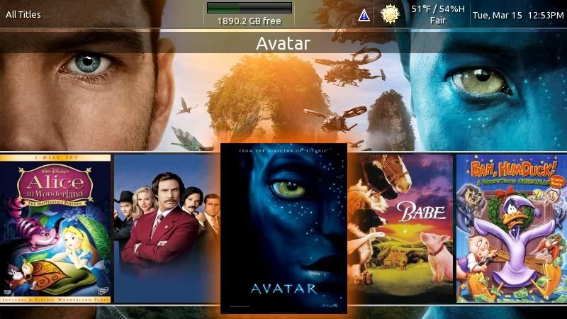 When you pause on a movie for X seconds, the cover slides out and up into this next screen : 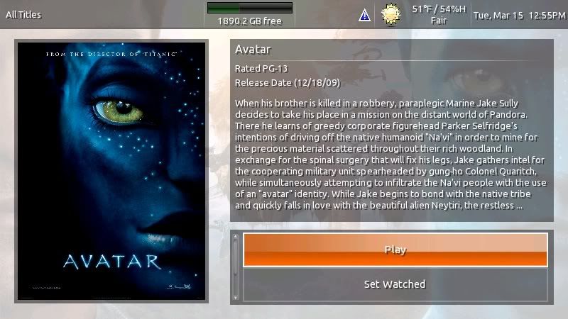 which has a limited selection of options - play, set watched, and fetch metadata. Here's the video clip: http://www.youtube.com/watch?v=3cov_Ywmm_s btl.
__________________
PHOENIX 3 is here! Server : Linux V9, Clients : Win10 and Nvidia Shield Android Miniclient
|
|
#14
03-16-2011, 08:52 AM
|
|||
|
|||
|
Quote:
There we go! We're headed in the right direction now. Last edited by bialio; 03-16-2011 at 08:54 AM.
|
|
#15
03-16-2011, 09:00 AM
|
|||
|
|||
|
That coverflow works, very simple. If I could make one recommendation: to maintain consistency with the rest of the screens, remove the 3D bars above and below the DVD covers. Instead, just use the background screen like the title bar area.
I also think you could make the non-focused covers smaller. Show off that background! I presume the GetMedata button is located under the other two, hence the scrollbars. Personally, I hate scrollbars. Clutter, clutter. Grant Last edited by OneOfMany; 03-16-2011 at 09:02 AM.
|
|
#17
03-16-2011, 09:37 AM
|
|||
|
|||
|
Quote:
|
|
#18
03-16-2011, 09:46 AM
|
||||
|
||||
|
Quote:

__________________
PHOENIX 3 is here! Server : Linux V9, Clients : Win10 and Nvidia Shield Android Miniclient
|
|
#19
03-16-2011, 09:50 AM
|
|||
|
|||
|
I like the fade away scroll idea as well. Normally, I feel that scroll bars are used once. Especially in this type of environment where the user is working the interface on a regular basis, once the user knows it scrolls, they don't need to constantly be told it.
I like the way the cover transitions to the detail page, however after watching it about 42 times, I really started to notice the inconsistency between the coverflow and detail page. I feel the background elements should remain consistent to offer better (here it comes...) flow lol. Example of detail page
|
|
| Currently Active Users Viewing This Thread: 1 (0 members and 1 guests) | |
|
|
 Similar Threads
|
||||
| Thread | Thread Starter | Forum | Replies | Last Post |
| Plugin: OSD Enhancements | jusjoken | SageTV v7 Customizations | 10 | 03-08-2018 05:23 PM |
| Phoenix thoughts with some defects and Improvements | Gustovier | Phoenix | 2 | 03-10-2011 03:43 PM |
| Music Feature Enhancements | Brent | SageTV Software | 48 | 07-28-2010 09:58 AM |
| Search enhancements? | sleemon | SageTV Customizations | 2 | 06-18-2005 11:28 AM |


 Linear Mode

